
Three Ways To Build A Device-Responsive Website

While going through support logs that date back to when we first started, we just found out that every single customer of Zen WP in past 14 months requested some sort of support related to the responsiveness of their website.
That information didn’t come as a surprise because everyone today knows that responsive web design is becoming more and more relevant. After all, Google confirmed in 2015 that more searches take place on mobile devices than on desktop computers for the first time in history.
This means that your customers and visitors are probably going through your website on their mobile phones, and if your website does not function well on smaller screens or it doesn’t appeal to them, it’s not relevant to them. In other words, you’ve lost them.
And speaking of relevancy, as a result of the trend, Google has confirmed numerous times that responsive websites will have a significant affect on SEO.
So there you have it: two very important reasons why you have to make sure your website is responsive (not only on mobile devices but on tablets as well).
You Have Three Choices
There are actually three different ways that you can create a mobile responsive site:
- m.Dot: This configuration functions by the website detecting what type of device is being used to access the site. If a mobile device is detected, it will redirect the user to a different part of the site, typically to a subdomain like www.m.zenwp.co where a completely different HTML will be served. This is a very common option but also the worst. We’ll explain why in a moment.
- Adaptive: Commonly abbreviated AWD for Adaptive Web Design, this option is very similar to the m.Dot option in that an appropriate HTML version will be generated depending on the detected device. However, it only uses one URL instead of redirecting you elsewhere. This option is better than m.Dot but still not recommended.
- Responsive: Don’t get this option confused with the broader term, Responsive Web Design, which is used to describe mobile optimization more generally (everything discussed on this page). Responsive websites will show the exact same content across different devices. Only the layout of the content will be influenced by the size of the screen. This is by far the best option and all modern WordPress themes utilize it.
As I mentioned, almost all modern WordPress themes will be responsive, which means most of the technical work will already be done for you. However, you still have the option to add an adaptive or m.Dot configuration as well.
My personal recommendation is to create responsive websites and not adaptive websites nor m.Dot configurations. I’ll explain each option and once you fully understand them, you’ll agree with me as well.
m.Dot
To set up a mobile site using the m.Dot method, you’ll need to create a subdomain through your domain registrar. The industry standard is to use www.m.website.domain, hence the name m.Dot.
Then, depending on your host, you might have to purchase a second hosting plan so that your www.website.domain can point to your first hosting plan and your www.m.website.domain can point to your second hosting plan.
After both websites are built, you’ll have to set up a redirect on your main website (www.website.domain) so that if it’s accessed by a mobile device, it will redirect the user to the second website (www.m.website.domain).
With this method, you’ll have different content served through different URL’s.
Once again, this option is terrible in every way to both you and your visitors.
To explain why, let’s first look at it from a UX perspective. Let’s say that your checking account is with Chase Bank and you usually check your online statements at home, on your laptop. When you go to www.chase.com on your laptop, you’ll see something like this:
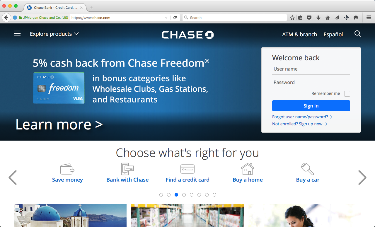
You access this website all the time so you know the ins and outs of it and you’re comfortable with it. But one day, when all you have is your iPhone, you get the need to check something important, like a secure message on your account for example. So you open up your phone and go to the same website (www.chase.com).
However, instead of seeing what you’re normally used to seeing, you get this:
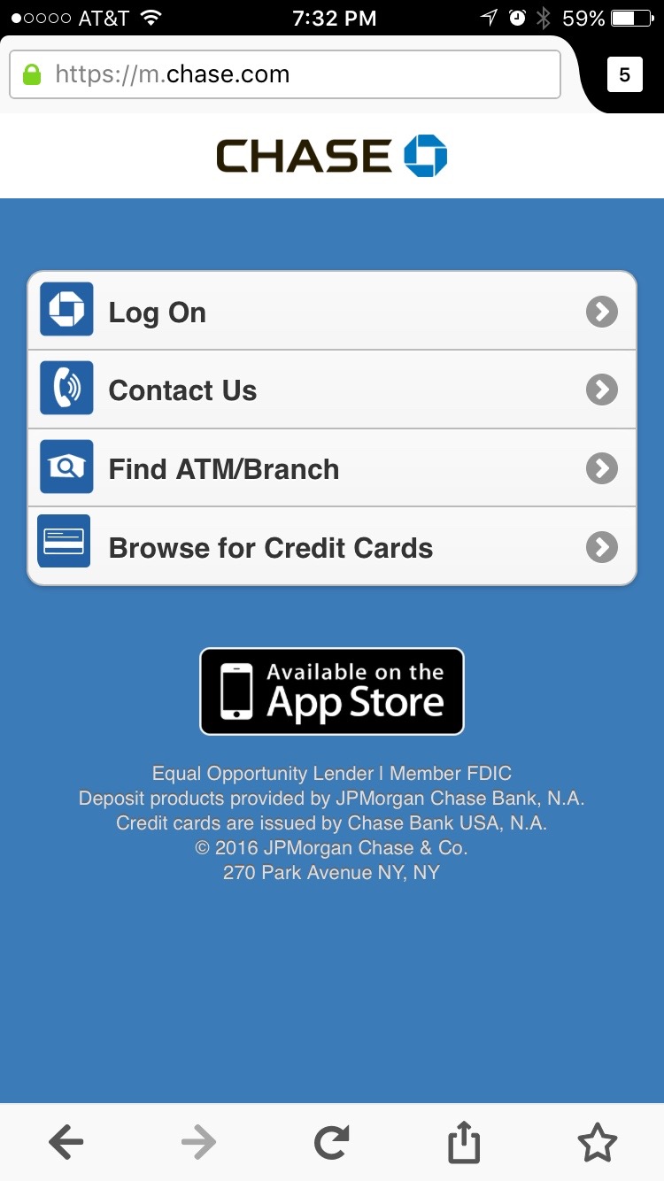
You don’t like what you see because this is totally unfamiliar and you find out that the function you need isn’t even offered on the mobile version of this site. So you select the option to switch to the full site. But because the full site isn’t optimized for your iPhone, you end up spending 20 minutes doing something that should have taken less than three minutes!
You can see how this can quickly become frustrating for your users. Now imagine if you rely on your website to sell something to a visitor. Do you think they’ll be able interact with the site as you intended?
And speaking of switching to the full site, we analyzed user behavior for our clients who used the m.Dot configuration and found that most visitors chose to switch to the full site when they were redirected to the mobile subdomain. That was enough evidence for them to ditch the m.Dot and go with a better option.
Another reason why the m.Dot should be avoided is because it’s not good for SEO. Search engines are not friendly to two completely different HTML versions of the same site, especially if one of them has a poor level of user interaction and high bounce rate. Plus, that redirect that you have on your first page? Google hates redirects.
Unfortunately, the m.Dot configuration is still widely used. Why? Simply because it was the industry’s first answer to mobile web design so just about everyone jumped on it when the word spread.
And now it’s become outdated technology.
The good news is that companies seem to be moving away from it. In fact, if you visit www.chase.com on your mobile phone, you will not longer be redirected to Chase’s mobile subdomain as of 2016. Instead, you’ll find that their primary site is now responsive. To access www.m.chase.com, you’ll have to manually enter that URL in your browser. So it looks like it’s only a matter of time until they phase out their usage of the m.Dot.
Adaptive Web Design
Google refers to this as “dynamic serving” because the content that will be shown to the user will depend on what device the user is using. In other words, different content will be displayed through the same URL for different devices.
Let’s say a visitor accesses a website. The first that will happen is that the website will “sniff out” the user’s device (user-agent) and determine what type of device the user is using.
Then, the website will choose to generate a particular set of content appropriate for that device instead of redirecting you to a different site or a subdomain like the m.Dot.
This option only makes sense in very rare circumstances and most website owners will have more reasons to not go down this route. Here are two reasons why:
First, doing this isn’t easy and will require a team of developers to get it done correctly. This means huge development costs and complicated upkeep.
Even if it’s done correctly, there are risks. Detecting user-agents is an error prone technique so it’s not uncommon for desktop visitors to be presented with content intended to be displayed on mobile devices and vice-versa. And if that’s a prospective customer visiting your site, you’ve lost them right there.
The second reason why you shouldn’t create an adaptive site is the same reason I used against the m.Dot argument: SEO. Having different content for the same elements on the same website is bad for SEO.
Having said all this, you’re now probably wondering in which circumstances it might make sense to have an adaptive website.
We have almost 1000 websites under management at Zen WP and only two of those websites use an adaptive set up.
The two websites are eCommerce websites that sell products that can be customized before purchasing them. When a product page is accessed from a desktop computer, the user has anywhere between 5-10 different ways that he can proceed to the next step. Then there’s the fact that the menu options, social sharing, and footer options are still present. That’s a lot of links…
Obviously, these options must be presented to users in a different way on mobile devices in order to keep them from getting overwhelmed. And some features like social sharing might be better off hiding.
Websites like these are the only ones I would even consider for adaptive configurations.
Now you’ve probably read that and thought to yourself that you have a complicated website and thus, you might have to consider the adaptive option.
As a developer, you have no idea how many times I hear that from customers and my answer is always this:
“Stop thinking about how to structure your complicated website’s content. Instead, ask yourself why your content has to be complicated.”
If you have a complicated website, the goal isn’t to find the right type of responsive option for your site. The goal is to make your site less complicated.
People behave differently on the web than they did 15 years ago. You can’t expect to keep people’s attention by putting links to all 60 of your pages on your homepage. You have to get right to the point. In fact, you have about 15 seconds to make your point or your customer will already have left.
Which brings us to the last option…
Responsive Web Design
Responsive Web Design can only work if your content is simple and to the point (which it should be). It’s about displaying the same content through the same URL but optimizing it for different devices through the use of fluid design, proportion, and of course, CSS.
This option is SEO-friendly and user-friendly.
The best part is that just about every WordPress theme developer knows the value of responsive web design over the other two options, so nearly all modern WordPress themes will be responsive. That’s good news because that means most of the work will already be done for you.
All you have to focus on is creating great content!
However, the code that makes WordPress themes responsive can conflict with various elements of your content depending on what you put on there. That’s why it’s always important to either use a staging site or check the front-end for issues immediately after making changes.
If there is conflict or the content you changed isn’t showing like you want it to, that’s when you need to contact your developer, or if you’re subscribed to Zen WP, let us know so that we can immediately correct it.
If you’re new to the concept of responsive web design or you just want some inspiration, check out this short list of really good responsive websites:
You can either view these websites on on both your phone and desktop, or you can just open up a web browser on your desktop and manually shrink and expand the window to see how the layout of the content changes as the window size changes.
Questions about what you read? Feel free to ask me below.
